Correlation of countries on the map. Brain illusions
Many people know that the usual geographical map the world does not reflect too correctly real ratio areas of countries, and especially seas and oceans. The use of the Mercator projection leads to many distortions when, for example, Greenland looks larger than Australia... A fundamentally new projection proposed by Japanese designers made it possible to build the most accurate map world that humanity has ever seen.
How did they do it?
A traditional map of the world is constructed in an ancient way, in which the image from the surface of the globe is transferred to a flat map using the Mercator projection. As a result, we get Greenland on the map several times larger than Australia, while in reality Greenland is three times smaller...

But a map built according to the principles of the AuthaGraph projection can be called truly innovative! Here the proportions of land and water remain unchanged and correspond to what we see on the globe. For this development, AuthaGraph received a prestigious award - the Japanese Good Design Award.


Then comes the original process of transferring the image onto a plane by combining various methods of projection through intermediate objects. This "multi-layer display" reduces the number of errors and monstrous distortions that arise when traditionally unfolding the surface of a globe into a flat map.

Of course, it is impossible to achieve complete perfection, but the map from AuthaGraph comes as close as possible to it.


How do the authors of the new world map explain the need for its appearance?
“Antarctica was discovered in 1820, and the first man reached the North Pole in 1909. In the 20th century, relations between East and West and North-South problems came to the forefront of world politics. The main territorial interest was the land, which was the human habitat. But since the end of the twentieth century, dwindling resources and environmental problems have forced attention to the polar regions and the territory of the oceans...
The AuthaGraphic World Map aims to support this new perspective and show what our globe actually looks like and how the interests of different countries and groups are distributed across it."

According to its creators, new map world will allow you to look at the planet and its individual corners from a new angle and free yourself from ingrained stereotypes like “Western World”, “Far East”, “go north”.

For comparison: a world map drawn in 1844

World map of the 1490s, with the help of which Columbus convinced Ferdinand of Aragon and Isabella of Castile to support his expedition.


Once upon a time, the world's cartographers were faced with the task of drawing our three-dimensional planet on a two-dimensional map. Flemish geographer and cartographer Gerard Mercator found a solution that now bears his name - the Mercator projection. The scale on the map in this projection is not constant; it increases from the equator to the poles. Because of this, distortions are introduced into the sizes of objects. Greatest distortion for objects at the poles, the smallest at the equator. That is, to compare the areas of two states, you need to place them in the same place on the map so that the distortion is the same.
For example, Russia, moved to the equator, no longer seems like a giant northern country.
See:

The USA, placed on a par with Australia, seems incredibly small:

If Romania were an island in the Arctic Ocean:

Australia is bigger than it seems - it can cover the whole of Europe:

If Brazil is moved to Asia:

Indonesia stretches almost the entire width of Russia

Greenland is not that big compared to the USA or Brazil:

China moved to Russian territory:

Canada in South America:

California is almost the size of the UK:

Australia, placed in North America, seems really huge.

Antarctica is not much larger than Brazil


The world map that we have become accustomed to since childhood and which we use almost daily Google Maps, - not quite correct. Russia is gigantic in size; Greenland is larger than South America; The equator is not located in the middle, and the continents are elongated at the poles. This is the Mercator conformal projection.
The projection was invented in the Middle Ages by Gerard Mercator (1512-1594), a Belgian geographer and cartographer, to represent the round Earth on a two-dimensional plane for the needs of navigation. It preserves the angles between the directions (whatever that means), but the sizes of the continents are distorted.
After 500 years, two smart guys made the map interactive, opening people's eyes to the real world. amazing world. The result is a cooler toy than Pockemon Go, where you can rearrange countries and compare them. The author of the article left to play at 12, returned only at five in the evening...
.png)
While Hillary Clinton accuses Russian hackers of hacking the mail of the US Democratic Party, let's compare Russia and America. More Russia.
.png)
But only one and a half times...
.png)
The territory of Russia could fit two Europe and two Australia, South America, Africa and Asia almost entirely... Why does Russia look smaller when it “moves”? This is the Mercator projection. When moving countries, you can compare them, but we must not forget that this is just a game of imagination. In other words, Russia would be of this size if it were in the place of Africa, Australia, and so on...
-1.png)
Australia looks tiny on the map - somewhere on the outskirts of the world. But it's the size of America.
.png)
Larger than Europe and only slightly inferior to China.
-1.png)
The USA, Australia and India are located in Africa. By the way, on interactive map You can not only move countries, but also rotate them 360 degrees. Very convenient.
-2.png)
What is Greenland? I used to think that this was a huge icy continent, which for some reason was called an island.
.png)
About the size of the European part of Russia...
.png)
But this is the real Greenland! The area is the same as the Democratic Republic of the Congo. In the Mercator projection, the land area expands at the North and South Poles and, conversely, narrows slightly at the equator.
.png)
By the way, about the poles. Antarctica doesn't even fit on the map. The poles cannot be depicted on it - it is flat.
.png)
But what happens if you place it in the Atlantic Ocean? We have found Atlantis!
.png)
Let's move it to Russia and Antarctica again goes beyond the edges, stretching to infinity. This is what the Ice Continent would look like if it were the Russian Federation.
.png)
The largest countries in Africa...
.png)
Let's imagine Africa is trying to take over the world. It looks like M&M's spilled on the table.
.png)
America is taking over the world...
-1.png)
Russia... I just moved them to the North Pole area.
-2.png)
Place the United States in the Mediterranean Sea and you get the Roman Empire. This is how she once was. Another interesting nuance: American cities have exactly the same climate as European ones. After all, the weather in Chicago is similar to that in Bulgaria, Florida is similar to Egypt, and California can easily be confused with Spain...
-3.png)
On the contrary: six large European countries (Spain, France, Italy, Germany, Poland, Romania) in the United States. Conclusion: Europe can move entirely to America. And there will still be room.
-4.png)
Another former empire is the British. The small island country has managed to leave its legacy all over the world.
-5.png)
I read somewhere that 78 Italys can fit on Russian territory. I checked: 23 fit. But this is because Italy has become larger.
-6.png)
Japan is shaped like Baikal.
-7.png)
There are only four places in the world where you can admire geysers: Iceland, Kamchatka, New Zealand and Yellowstone National Park in the USA. This is what happens if you put Iceland in each of them... It's tiny.
.png)
"Moscow region" in Spain.
.png)
The tiny island could be lost somewhere in the Mediterranean Sea. And no one would notice.
.png)
Or in the Gulf of Mexico...
-1.png)
Madagascar fits perfectly into the Sea of Okhotsk.
-2.png)
And Jamaica is in White... But they wouldn't like it.
-3.png)
Have you heard about the country of New Caledonia?
.png)
No surprise...
.png)
Finally, the ten largest countries on the equator - this is the best way to compare their sizes. Russia, Canada, China, USA, Brazil, Australia, India, Argentina, Kazakhstan, Algeria. What is Algeria doing in the top ten? So I was surprised...
-1.png)
Many people are aware that the world map we are used to does not accurately reflect the real ratio of the areas of countries, much less seas and oceans. The use of the Mercator projection leads to many distortions when, for example, Greenland looks larger than Australia... A fundamentally new projection proposed by Japanese designers made it possible to construct the most accurate map of the world that humanity has ever seen.
How did they do it?

A traditional map of the world is constructed in an ancient way, in which the image from the surface of the globe is transferred to a flat map using the Mercator projection. As a result, we get Greenland on the map several times larger than Australia, while in reality Greenland is three times smaller...

But a map built according to the principles of the AuthaGraph projection can be called truly innovative! Here the proportions of land and water remain unchanged and correspond to what we see on the globe. For this development, AuthaGraph received a prestigious award - the Japanese Good Design Award.


Then comes the original process of transferring the image onto a plane by combining various methods of projection through intermediate objects. This "multi-layer display" reduces the number of errors and monstrous distortions that arise when traditionally unfolding the surface of a globe into a flat map.
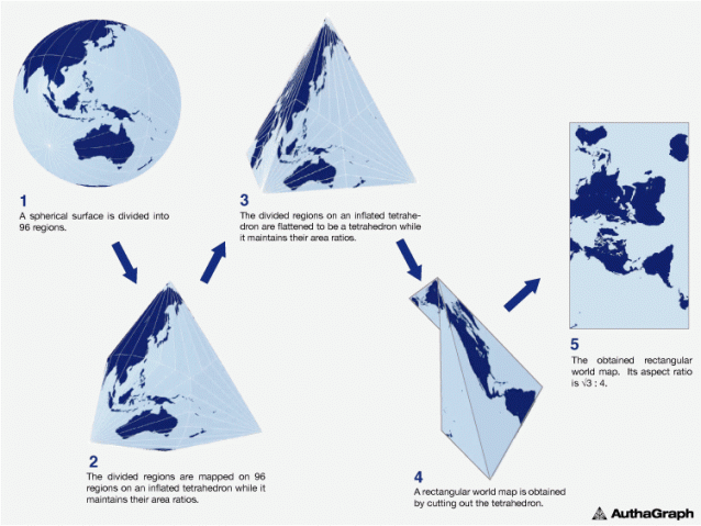
Of course, it is impossible to achieve complete perfection, but the map from AuthaGraph comes as close as possible to it.

“Antarctica was discovered in 1820, and the first man reached the North Pole in 1909. In the 20th century, relations between East and West and North-South problems came to the forefront of world politics. The main territorial interest was the land, which was the human habitat. But since the end of the twentieth century, dwindling resources and environmental problems have forced attention to the polar regions and the territory of the oceans...